UX/UI Design
Intuitive interfaces that users love. We craft user experiences and interface designs that balance beauty with usability, turning complex workflows into seamless journeys.
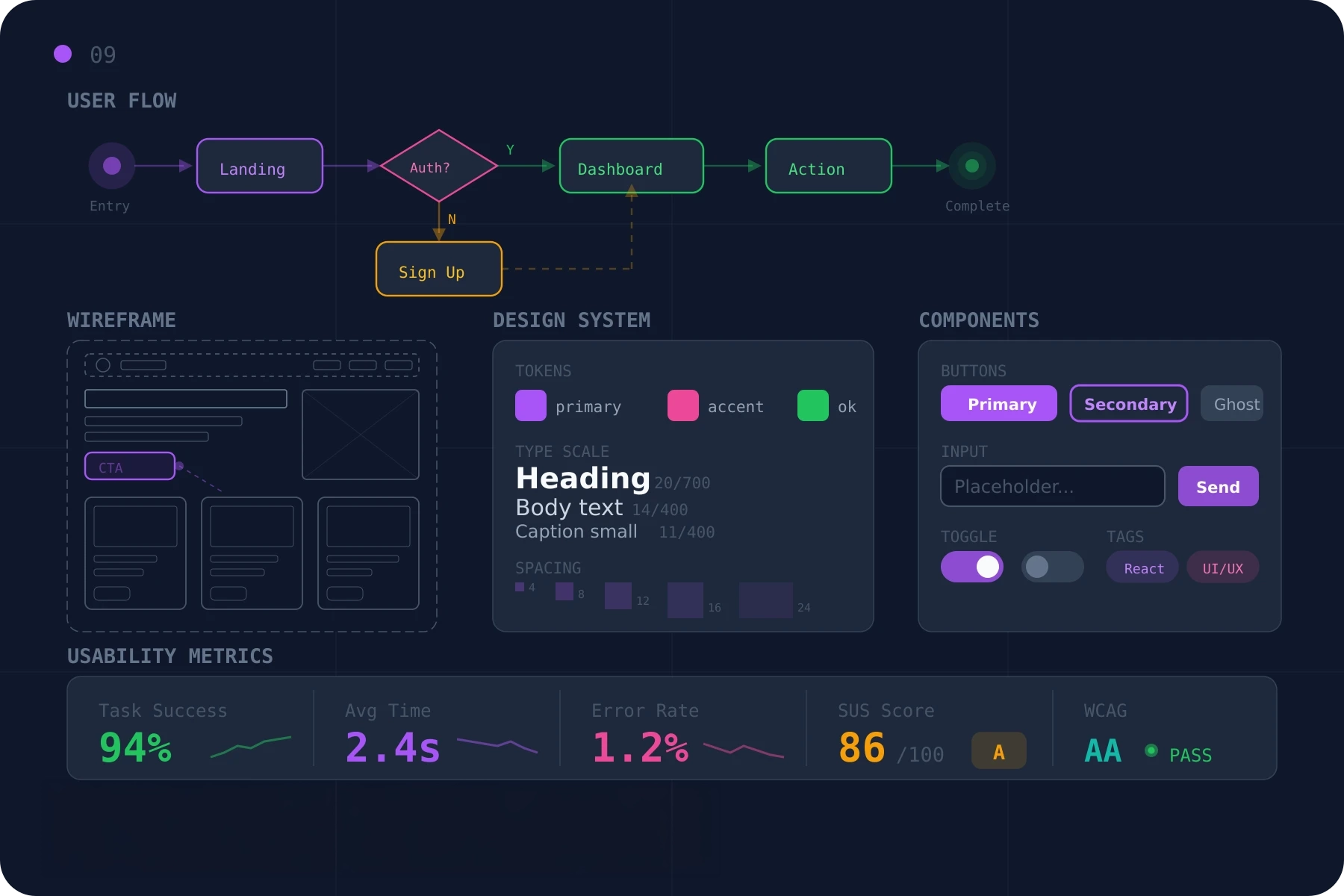
Beautiful interfaces mean nothing if users can't find what they need. We design digital experiences that feel intuitive from the first click — where form follows function and every interaction earns its place.
Research-Driven Design
- User interviews, competitive analysis, journey mapping
- Information architecture grounded in real behavior
- Hypotheses validated before pixels are pushed
We start by understanding your users — their goals, pain points, and behaviors. User interviews, competitive analysis, journey mapping, and information architecture exercises inform every subsequent design decision, so by the time we open Figma we're solving the right problem, not guessing.
Iterative Prototyping
- Wireframes to high-fidelity prototypes, quickly
- Figma, Framer, and Principle for interaction modeling
- Test early, test often, refine based on real feedback
Ideas become interactive prototypes fast. We work in Figma for the static frames and design systems, Framer for richer prototypes, and Principle when motion details matter. Maze and UserTesting put the prototype in front of real users, so the design that goes to engineering has been validated, not assumed.
Accessible by Default
- WCAG 2.1 AA targets from the first wireframe
- Color, contrast, focus order, and keyboard paths baked in
- Audits and remediation for existing products
Great UX works for everyone. We design with accessibility in mind from day one — color and contrast within spec, focus order and keyboard paths planned, screen-reader semantics specified for engineering. For existing products, we run audits and ship the remediation plan, prioritized by impact.
Design Systems That Scale
- Component libraries with usage rules and variants
- Tokens for color, type, spacing, motion, elevation
- Handoff documentation engineers can actually use
Consistency breeds familiarity. We build component libraries and design systems that keep products cohesive as they grow — variants and usage rules, tokens for color and type and spacing, motion specifications, and the handoff documentation engineering needs to implement the work without translation losses.